PROVIDENCE EXPRESSCARE

Developing an optimistic healthcare brand.
Regional healthcare giant Providence, looking to carve out space for their Urgent Care and Virtual Care services in a crowded marketplace, rebrands as ExpressCare.
In a landscape dominated by design that’s safe and sterile, it explores ways to bring humanity and optimism into the brand through color, iconography and photo style.


Patients are front and center, smiling and healthy. Patterns and iconography help the rest of visual brand come alive.
The message is straightforward and clear: healthcare can be friendlier, simpler, and quicker. The feeling of health isn’t just something benign; it’s joyful.

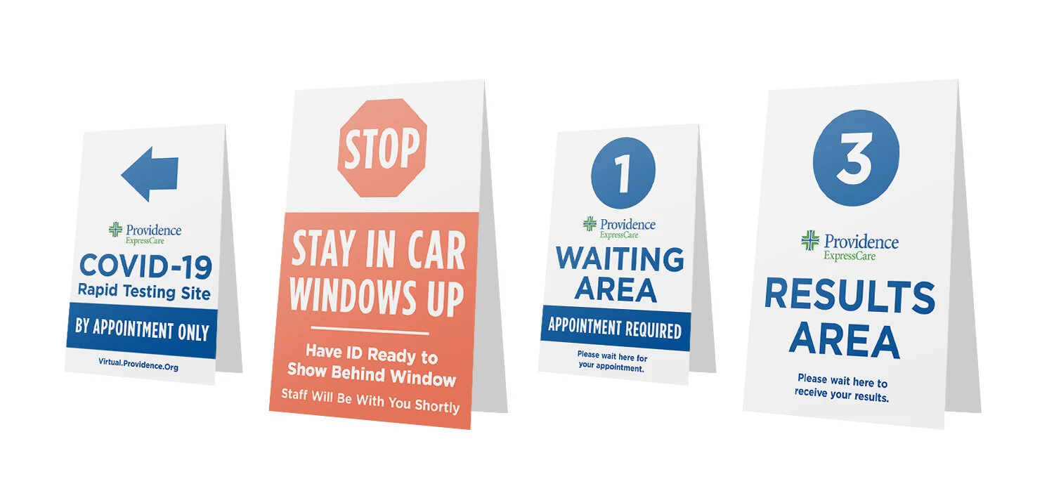
In addition to typical brand elements, a range of environmental pieces are created: video screens for waiting rooms, signage for COVID testing, and storefront designs.